
Sugy
Mobile UX design for helping Type 2 Diabetes patients
Problem Statement
Diabetes is 7th cause of death in the US. Keeping a record of Blood Sugar, meals and activities are vital for monitoring health conditions in Type-2-Diabetes patients. If people, specially senior citizens, don't find ways to easily record their health data, they might face some serious threats to their well being.
Design Goal
Designing an easy to use mobile application that helps senior citizens keep record of their Blood Sugar and other health indicators.
Overview
Team
Hesam Andalib, Amir Mostafavi
My Roles
-
Story mapping, wireframing, UI prototyping
-
Conducting User Research
Sponsor
Dell Medical School
Timeline
Feb 2020 - May 2020
Tools
-
Balsamique
-
Figma
-
Dialogflow

Approach
After doing some research on the subject, the design phase started with story mapping. By summing up our findings, we started wireframing and testing the primary sketches with potential users and employed the takeaways in the final stages of the UI design. Designing a Voice user interface was one of the key features that we added to this design to make the meal logging process more easy for the end user.
Design Product
Background
This project was proposed by researchers at Dell Medical School. They were dealing with the difficulties of using mobile applications for helping T2D patients of underserved communities for their health records.
30 million Americans have type 2 diabetes and these people need to monitor their blood glucose and be careful about their meals and activity level. Self-management mobile applications can help these patients to keep track of meals and blood glucose and help them to set personal goals, track progress and get feedback about their lifestyle.

Roadmap

Research
For kicking off the project, we started with two research steps. Dell Medical School provided us with the result of their research and ask for simple solutions that enables elderly and underserved people use new technologies for tracking their health records.
Of people living with Type-2-Diabetes

First reading scientific papers and sources to get information about advancements and past experiences.

Popularity of features in existing apps for T2D patients


Second, Investigated 6 apps, half of which were direct competitors and the rest were general health monitoring apps.
We reflected the possible features in a Kano model to use in our story mapping phase.
Synthesize
After the research and competitive analysis, we started to synthesize all the data gathered and make use of it through story mapping.
Story Mapping
We started with story mapping in order to have a roadmap for the design stage. We revised our story map two times during the project to make it more accurate and specific to our user needs.
.jpg)
The key takeaway from this process was narrowing down our users, their pain points and finding the focus and direction of our design.

Design
The design process was aimed to start with wireframing and getting feedback from potential users. However, in the middle of th project, the COVID-19 pandemic started and the Shelter-In-Place went effective that made access to users very difficult. We decided to take as much as feedback from family members close to persona and continue to the next levels.
Design Goal
Help people over the age of 60, struggling with T2D
track their diet and health data comfortably
Design Strategies

Wireframing
At this stage, we were thinking of designing a UI flow for the patient that is easy and simple to use. We also thought that on the other end, how will the doctors' UI look like based on the data gathered by the user.

User Testing
we asked some of the old family members to take a look at the wireframes via a Zoom call and provide us with their feedback.

Mid-Fi Prototype
Based on users' feedbacks and collaborative discussions, we made some decisions to move the design forward. Two of the main challenges at this stage where as follows:
Challenge
How might we make the feedback feature easy to understand?
Decision
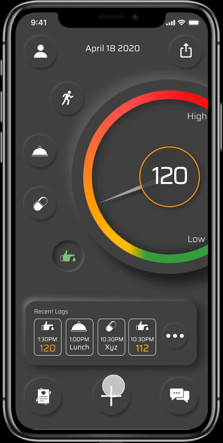
Adapting the gauge form as our feedback element because everyone is already familiar with it

Fuel Gauges have been adapted to cars at about 100 years ago.
Mid-fi Design Output

User Testing
We asked some of the old family members to take a look at the prototypes via a Zoom call and provide us with their feedback.

Challenge
How might we make our design more accessible?
Decision

For a design to be inclusive, it must provide both dark and light theme for users.
Decision
Use labels wherever colors have meaning

Aha Moment!
During the pandemic, everyone had an eye on news. One news was shocking and sad but made an Aha moment in our design:

Decision
Employing VUI in the design for not tech-savvy users

Hi-Fi Prototype
The outcome of all the research and design iterations took us to a point of having a clear idea of what the final prototype should be to serve our users.


Home Screen in Dark and Light mode with Blood Sugar Gauge as default

Log Options
Defining a Meal
Logging Meal
Logging Blood Sugar
Design For iWatch
During one of the user testing for Mid-Fi prototype, the user raised a question that we were thinking of during the design process:

Idea
Enable Relative monitoring with smartwatch
Question
What if I pass out an hour after lunch? How will this app help me?
Reflection
This project started before the pandemic and ended in the pandemic. The effect of such conditions in designing UX projects that require constant feedbacks from users is considerable. Though I have been able to get feedback from some users remotely, I plan to get feedback from real users as soon as possible.
Lessons Learned
There were lessons in this project that I will remember for the rest of my life:
-
Story Mapping: Narrowing down the user base of complex applications can help finding challenges that can benefit other users as well
-
Looking for inclusivity and universal design can bring in creative ideas that originate in other fields of design
-
VUI: Being considerate about what is happening around us can expand our level of understanding and break our false assumptions.
-
UI theme: Designing consciously and backing up the design with research can help us build a solid foundation that can be applied in all the design works.