
Kindact
Mobile UX design for promoting generous behaviors in society
Problem Statement
During the COVID-19 pandemic, many people experienced financial hardships and they felt ashamed to ask friends and their acquaintances for help. We all knew some and wanted to help them while keeping their dignity intact, but we didn't know how to do it!
Design Goal
Designing an experience that promotes generous behavior in society in general and facilitates giving behaviors even when not asked to help
Overview
Timeline
June - August 2020
My Roles
-
Research assistance
-
UX design and prototyping
-
User testing
Background
This project was defined when people faced with financial hardships due to the COVID-19, and some political issues caused some feeling of segregation in our society. So the idea came up that how we could unite our community and create a supportive spirit among people during such situations even when people in need doesn't ask for help.
This project is the result of my summer internship for Sentier Strategic Resources which is a UX design and research agency.
Goal
Designing an experience that promotes generous behavior in society in general and enable people to help each other during financial hardships
Approach
The project was managed with agile method in 7 sprint in 14 weeks.
In this project, I contributed in the research phase and worked actively in the design and prototyping stage. The main tools that I used for this project were Figma, illustrator, Miro and my freehand sketching skills.
Design Process

Research
For kicking off the project, we started with secondary research. The goal of secondary research is to understand the reasons that people donate and factors that impact this behavior. My main findings at this stage are depicted at images below.
These findings convinced us that this is a viable problem space to work on.

During literature review, we learned about "Fogg behavior model" that says occurrence of any action requires convergence of motivation, ability and trigger at the same moment and donating is not different from others.

Story Mapping
We looked at competitors to classify their features and built out a feature matrix.
Based on the feature matrix, We found that we must consider recommended/popular donations; we should have donation categories and measures to build trust for users. Our platform also could have donor ranking, automatic recurring donation and social media sharing.

The main takeaway of this section that was used in the design stage was a list of features that I must, should and could incorporate in the final solution.

Survey
We conducted a survey about generous behaviors in society to get some quantitative understanding of the problem space. The main takeaways of survey results are shown below:

User Interview
To dig deep in users needs and expectations, we interviewed 12 users in 1-hour interview sessions about their generous acts and donation efforts. The main takeaways of this step are shown in the image below.

Research Recap
After doing all the research work, I can say that the main finding that were consistent in secondary research, user survey and user interviews were these items:

User Journey Map
The other method that I used in this project to conclude the research findings, was to map the current state of user journey for donating activities.

Design
Based on our research findings, persona and user journey, I can say that final solution must meet these goals:
User Persona

To synthesize research insights into a usable document for the design stage, we created a user persona so that all team members can empathize with real users and have an understanding of their needs, challenges and goals in the donation process.

Design Scenarios
To start generating ideas for this experience, we came up with 3 donating scenarios that our persona might experience:

Ideation
Everyone in our team started ideating on each scenario to explore options and features then we gathered and voted on each idea to find useful and genius features for the purpose of the experience.

Based on our scenarios and ideation output, I prepared an information architecture diagram for the application to think and plan for details before starting the wireframing and prototyping. It helped a lot in clarifying next steps for the design process.
%201.png)
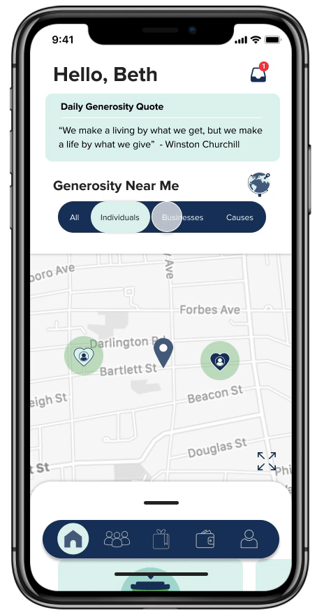
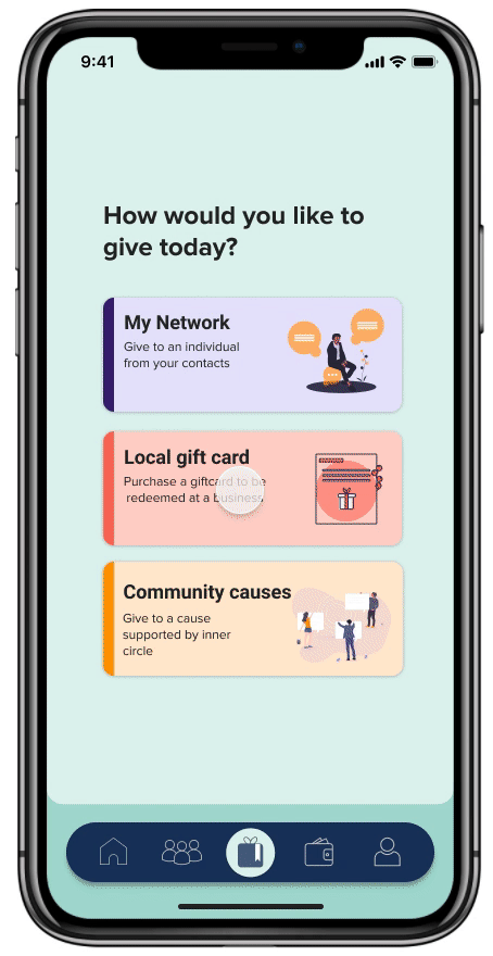
Lo-Fi Design
I started working on a wireframing and low fidelity prototype based on the information architecture and ideas that I had from the ideation process. Here are some of the screens that I made and used for user testing session.


User Testing
For user testing of the low fidelity prototype we decided to go with the RITE method and iterate on the prototype after each 3 user testing sessions. In overall we tested the prototype with 11 users and iterated it 3 times.

The main takeaways of the user testing session is shown below:

High Fidelity Prototype
The high fidelity prototyping stage is when I bring emotions and feelings to the design by deciding about color set, typography and considering accessibility principles. I worked on this part of project with another teammate and started by studying psychology of colors. Colors that we decided to work with were:
%201.png)
source: uxstudioteam.com
I started trying variants of these colors:

However I ended up using mint color as the dominant color since it is a combination of green that is an indicator of generosity, kindness and growth.
For designing high fidelity interfaces, I defined a design system consisting of colors, fonts and dimension of elements that should be consistent in all screens. Considering principles of accessibility and inclusive design were top priority in making decisions in this section.
Colors
Psychologically, green is the color that is associated with generosity. Blue is color for calmness. The dominant color of this app is the mint color that is a combination of green and blue

Font
Readability of the font was the main criteria in selecting a typeface. Proxima Nova is a modern sans-serif font that has a friendly appearance

Buttons
Ease of detection and interaction were the main reasons for deciding about dimension of Buttons

After defining the design system, I started polishing each single screen to create a click-through prototype.


Success Measurement
Though measuring success at the time of designing the prototype is not possible, I think the following KPIs can measure the success of UX design when the product is launched:

Reflection
If I look back to the project:
-
I found out that I need to do better at making sure that I’m keeping track of all the research findings and constantly going back and referring to those findings. Research happens over several phases, we have to run secondary research, survey, user interviews and so on. So during sprints that everything happens so fast, we might forget to go back and check with research. With a purpose to have smarter decision about design we need to be aware of all research insights.
-
Testing my Hi-fi prototype with users is a remaining part of this project that can make me sure about the use of colors and fonts or it can change my mind!
-
And the last thing is that this design focuses mainly on designing experience for people who want to donate. We didn’t work on the people who want to claim a need or start a fundraising cause. This part is missing in this work and for the next step, I believe I have to work on that part.